Welcome to the chaos!

It’s time to get chaotic. Creative chaos is waiting all around us, we just need to open our eyes and take advantage. Turn common into comical, or bring fame to tame. There are opportunities to use objects everyday and twist them, break them, flip them or mash them into something that will stop traffic and get people saying, “What in the…?”

Advertisers are always looking for ways to get attention. What better way than to get guerilla and turn the ordinary into something extraordinary. So let’s get creative cause a little (controlled) chaos. This blog will showcase the best in all things chaotic. Sometimes they are ads, sometimes they are not. My objective here is to get people to see the world from a different lens and maybe even step out of there comfort zone for a moment. Anyway, enough talking…Enjoy the show!

Play Muji

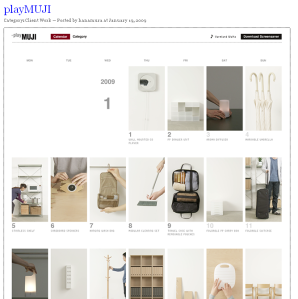
I came across this company on Adverblog. It is an interesting use of a well known medium, a calendar. Play Muji seems to be a company much like Ikea that we know here in the states. They appear to carry a lot of very stylish home  decor, storage, etc. They have created a flash website that is pretty clever in that instead of simply listing their products, they have created a product of the day sort of system using a calendar. I think this has a very interesting concept behind it that could be better utilized by advertisers and marketers. I see this as an opportunity to create an interactive online tool that users can use daily to keep track of their daily logs, but also be exposed to some cool new gadgets along the way. Kind of like those desktop “word of the day” calendars that re sold in every bookstore I have EVER been in. I don’t think that Play Muji has taken the interactivity of this calendar site to that level, but that may be a good next step in my opinion.

Here is a screenshot of the site.

playmuji

Take that Facebook

I found this ad again on Ads of the World (one of my favorite sites on the web). I absolutley love it. It is so clean and simple. They simply added a single letter to a well known icon among teens and college students to completely transform the pattern of thought. I love ads that can maintain such minimalism, yet make such a major impact.

And another reason I love this is because, over the last 4 or so years, I have seen facebook absolutely engulf the lives of college students. If they spent the time they are on facebook and instead read a book, this world would be a better place for it. I think this ad will make people think about their addictive habits to social networks like facebook.

faceabook

Great ad out of Brickman Agency in Isreal!

OU Ad Bowl

So I am in this group at OU called the OU Ad Association. Every year, we hold a competition to create mock Super Bowl ads for some of the more notable brands we tend to see every year during the big game. I created a poster for the Ad Bowl to advertise the event we are holding to show off and judge each others ads. So my idea plays off the fact that, nearly every year, the game itself is overshadowed by the ads. Well, OU does not usually have an amazing football team (although we are getting better), so I kind of spoofed that a bit with my ad. Hopefully the football team can forgive me, or at least not hurt me. 

adbowl_print

GlaxoSmithKline Pandol

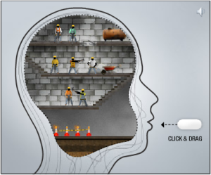
Here is a pretty cool example of how simple interaction in flash animation can make a lasting impact for consumers. As a new student of Flash, I love to see companies making use of the medium to help strengthen their advertising campaigns. This is just some simple user interactivity that helps to hammer home (no pun intended- see the ad to see what I mean) the idea that Pandol offers fast acting relief to a pounding headache. This ad was created by Memac Ogilvy out of the UAB.

See the link below to view the ad at Ads of the World. It isn’t the most visually clean piece of flash animation I have seen, but they took the concept and executed it cleanly with great effect. Examples of ‘flashvertising’ such as this are why I am learning how to use this fantastic interactive design tool.

headache

Ikea Personalized Catalogs

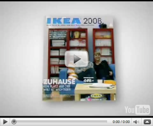
I came across this ad at ads of the world and thought it was very creative. I was not entirely surprised because IKEA is a very creative company and has done some good work in the past. The concept sets up the cover image of IKEA’s catalog in a number of heavy traffic locations such as shopping malls. The set allows people to get their picture taken on a recreation of the set that is on the cover of their massively popular catalog and recieve a copy of the catalog with themselves as the models. A very well created campaign. Below is a video about the campaign:

IKEA ad

Doritos Crash the Superbowl

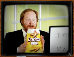
So as you may or may not know, Doritos has been running a contest allowing outside submissions to create a commercial that could be aired during the Superbowl. This is quite the honor, especially seeing as how the price tag this year is $3 Mil a spot. Anyway, the 5 top spots are up for voting on the site and I must say, they are quite good. My personal favorite is the “New Flavor pitch” commercial. What I found most impressive is that you could see the joke coming the whole time, yet it still was pulled off with amazing comic timing and made me laugh out loud. Click the screenshot below for a direct link to my favorite of the bunch, but I would suggest checking them all out. They are all well done.

screen-capture

You knew it was coming!

I had to post it. You knew someone was gonna use the pun!

6a00d8341c51c053ef010536ea400a970c-450wi

Photoshop goes guerilla!

I was surfing along on the blog creative bits and came across an interesting article profiling an adbusting campaign out of Berlin. The movement is carried out by creating photoshop window stickers that transform the ad from a billboard into a what appears to be a photoshop workspace. As you can see by the photo, this ad is to represent the false images of beauty that are presented in today’s print media. Images of celebs and beautiful women in these magazines and billboards are often heavily altered and give the false impression that these women are flawless in appearance. This in turn often creates a negative body image for “real women”.

photoshopfull

See the full story here…

The campaign reminds me distinctly of the Dove “Real Women” campaign. I thought there use of photoshop imagery within that campaign was also extremely well done and effective. Kudos to Ogilvy for Dove and kudos to those innovative Berliners.

The Economist (BBDO)

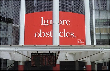
Let’s start out with my favorite- The Economist (BBDO)

economist

Pic 1) What a great use of surroundings! (My personal favorite)

economist-balloon-clio

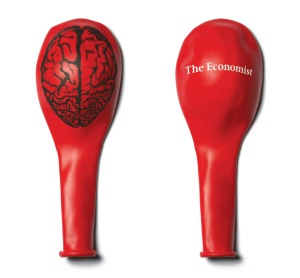
Pic 2) A fantastic example of non-traditional medium that works so well with the imagery and the message. A balloon expands just as your brain expands from The Economist. Great!

the_economist_lightbulb_0jpeg

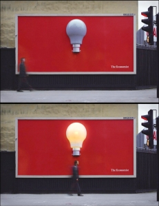
Pic 3) Once again a fantastic use of outdoor media. Try not to be inspired by a giant light bulb turning on above your head!

This campaign, in my opinion, is the quintessential piece de resistance of advertising. With little, even sometimes no copy or imagery, these ads leave such a lasting and dramatic impact on the viewer. This is truly minimalism at its best. Carl Andre would be so proud!